Saturday, 28 March 2015

FMP Friday's thoughts 27 March

Friday's thoughts 27 March

Who You Are and How Your Seen.

With one more Friday afternoon spent working in college, I could get a bit more work done. Today was a particularly interesting progression into my 'personality work'. I found Marriyah working at college, so I got her to complete several personality tests that could help me find out more about her personality, but also if I see her personality in the same way as she does.

First of all, I myself completed the test answering the questions with Marriyah in mind. I then had Marriyah take the same test and I could then compare the results of the two and see if there was any similarities.

The results were very interesting and different to what I thought. Comparing the two tests, I found that they were different in many of the traits. The biggest differences was the organisation skills and relaxation traits. Although I thought that Marriyah was a calm and organised individual, she is actually very stressed and disorganised. I think the reason I though of her in this way was because on the surface she has a calm personality and even in stressful situations she still seems to maintain this. When I worked with her in fine art I noticed her making lists of things to do and timetables. As I saw this I instantly thought that Marriyah was a organised individual. That along with the fact that I see her sketchbook normally full of work, it lead me to believe that Marriyah was calm and organised. I was wrong. In fact, having the results of the personality test from her, and talking to her more, I found out that although she appears to be organised and calm, she is in fact the opposite. It was just on the surface. Underneath she was stressed and disorganised.

This was one of the main differences in the test. I always thought of Marriyah as a calm person. However, the one thing that I did identify was her shyness. I think this was an important part and made a big impact on the test. If Marriyah had a more outgoing personality, then I think I would of got to know her a bit more and I might of noticed different parts of her personality. I think if someone's shy or outgoing, it tends to be one of the things we first notice about their personality.

It takes longer to find out their personality if someone who is shy, while if someone is more outgoing, they would show off more of their personality to the outer world and people would know them better.

As far as my project goes, I think the shy person is more interesting. It's better for me to try and find an aspect of their personality to incorporate into the jewellery. Not everyone knows the person and it's like finding and showing off a gem inside. We do not know the little things they have hidden and I would love to help show off this for Marriyah.

I'd like to have two pieces of jewellery, one showing Marriyah's personality, and the other showing how I see her personality. I might make a group design, or ask others to input their views of Marriyah's personality into the jewellery so its a wider range of others interpretation of her personality.

Today's given me a lot to think about.

Thursday, 26 March 2015

FMP The Presentation 26th March

The Presentation   26th March

There are three PowerPoints still to be done today including mine. With a two week holiday, I was hoping to get a lot of feedback on my work so that I could do a lot more primary and secondary research.

My PowerPoint was at 10am. I was ready and a little nervous to get it over and done. Even though I have improved at speaking in front of people, I think I still have a long way to go. I was eager to get feedback after I explained my project. I was really looking forward to hearing from everyone and getting honest comments, even if its negative. It's a good chance to improve and expanded my ideas. As I talked through each slide, I have to remember to speak louder and to look at the group. Although I did do this, I need to make sure to hold their attention and to get them involved with the PowerPoint.

With the talk over, I could then open the floor to questions, comments and ideas. This was one thing I wasn't nervous about, I was looking forward to it. With lots of good comments and complements on my project as a whole, I was happy. The most helpful advice was about my concept and my research.

I need to go to more bespoke jewellers and find out how they work with the customer. Perhaps show them my designs and get their feedback on my work? Maybe even see what they would do if they had this brief? I had emailed a couple of bespoke designers a couple of weeks ago, but I've heard nothing back from them. I have found two more I could visit, one in Birmingham and another in London. I could ask for samples, or to see the designs that they have done for others to get a better idea of design process. If I had the money, I would have a bespoke piece done for myself so I could see both sides of the process. With most pieces costing over £1000, I sadly don't have the money for that. I could ask to take part in some of the consultations they have with customers, but again I'm not sure they would let me.

Another thing that came up in the talk was my concept. Although they said it was very good, the personality of my client (Marriyah) wasn't really showing through. I think this is because I was focusing more on the business side of the bespoke jewellery. I had yet to really make a big leap forward in finding an aspect I wanted to focus on. I was sitting on the fence and I have no time for that. Having this shown to me was a very good thing. I need to make sure that this piece was like my pathway piece and showed off the concept side. Visually it might not have as big of an impact as my pathway piece because that was statement jewellery and I wanted to make a more wearable piece for Marriyah. It still doesn't mean I should loose any of the meaning behind it.

Having this in mind, I then talked about making two pieces of jewellery one being Marriyah's view on her personality, and the other on how other people see her. Taking two views of how personality is shown and interpreted and how the individual sees their own personality. I will have to talk to Marriyah about this.

Finally we talked about how my pieces will be shown. I first wanted to have my locket shown on a bust rather than just in a frame or lying there. I know in my pathway that having my piece on something resembling the body made a big impact and I got good feedback on this. I also would like some photos of Marriyah wearing the jewellery. One with Marriyah wearing the jewellery, the other two being close ups of the locket. If I were to make two pieces, then I would take six photos. I would then make the frames reflect Marriyah's personality as well I will have to look into this a bit more.

Along with all this I could make a little booklet giving the viewer information on how I made the piece, as well as how they could create their own personalised jewellery. It's something I'll have to think about.

Tuesday, 24 March 2015

FMP PowerPoint 24th March

PowerPoint   24th March

With the Easter holidays looming, I had to make sure I get as much done in college as possible. The first thing I have to do is my PowerPoint presentation. I got a lot of my slides done on Friday, so Monday I could spend a little more time on what I want to say, as well get the last few images. I have to make sure I have everything ready for Thursday. I still haven't done all my slides. With it being a half day tomorrow, I can finish it then and run through what I'm going to say.

It was mostly PowerPoint presentations today and seeing as I was listening, I tried to come up with good questions and comments to help my 3D family. With Jenny going first, I heard all about her design and processes. She had moved from realistic human forms to more abstract. While Jenny was talking, I made a small note to make sure I commented on them when it was our time to speak. With a lot of people giving advice, I was glad that Jenny seemed to like my ideas of looking at cubism and questions on the texture of her work.

The next person to show their PowerPoint was Adam. His idea for tiles with functions was a interesting concept. I listened and made some notes. I commented on colour and size choices that he might want to think about as well as asking about replacing broken tiles.

After the PowerPoints, I thought about my presentation. How might I answer the questions that were asked if it was my presentation, and what I might add?

 
I managed to look at the glass pieces I put in the kiln yesterday. They were cooling nicely, but with the temperature still to hot at 100°C, it needs a little more time before its ready to come out. I could take them out tomorrow morning and see which of them looks the best so I can try and make a test piece of what the locket would look like when I come back from the holidays.

While I was looking at my glass pieces, I was shown another student's work. He was working in glass and the effects he got from the slump moulds were simply beautiful. He went on to explain the different effects he used to get each glass form, changing the size of overhang on each one to create different forms and shapes. By far my favourite was the largest of the glass bowls. It was the one with the largest overhang. The edges had taken on a flowing smooth quality that had a very pleasing appearance. I have a feeling I might not be able to do this myself with my jewellery, but I want to keep an open mind as a couple of test pieces might give me a good idea whether I use it in this project. Keeping an eye on other students' work is a good idea as the possibility for getting new ideas is endless.

Monday, 23 March 2015

FMP Ribbons and Glass 23 March

 PowerPoint and Glass 23 March
 

With my PowerPoint on Thursday, I wanted to get a lot of my presentation done today. I also needed to make sure I have a good idea of what I was going to say. Luckily, with the amount of research I've done so far, I could spent a good 30 minutes talking people through it. I just have to make sure I have the key points from the research so they all understand and can properly give me feedback on my project. The feedback I get could really help and give me a good idea if I'm on the right track, or what I could do or change to improve.

As I make my choices on what slides I want, I can see what research I want to expand on and what are the different parts I could improve. My design stage, especially the interviews with Marriyah could be more documented. These are all things I hope to improve on as I go on.

While I'm doing my slides, I get the chance to talk to Marriyah about her piece. On Friday I got several different samples of ribbons for her to choose for her locket. I laid the ribbons out side by side so I could easily show her what was available. This also gave her the chance to pick up each one and feel the samples. As the ribbon is close to the skin, the feel is an important part of the decision making.

As I was talking to her, I asked her some more questions; What size locket she would like, and how long she would like the ribbon? She told me that the bigger the locket, the longer the length of ribbon, while the shorter ribbon would have a smaller locket. This was good to bear in mind in the future when I'm designing the jewellery so I know how big I want the locket and how long I want the ribbon.

Once I had done most of my PowerPoint, I could then have some time to sort out my mould and get it ready to be put in the kiln. First I had to fill my moulds with glass. I had three different types of mould so I thought I might as well see if different coloured glass had different effects when it was heated. As I carefully placed the clear, green and blue glass in the mould, I had to make sure I didn't put any dirt in with it as it will show up once it was finished. I'm hoping that this will give me a better idea of what sort of effect I can get from the glass.

After I had finished placing the glass into the moulds, it could then go into the kiln at 200°C overnight, with a 15 minute soak before letting the kiln gradually cool down. Then I can take the glass out and have a look at it. I'm just hoping that everything goes well and nothing breaks in the kiln.

Art Deco


Art Deco

The Art Deco movement in the decorative arts and architecture originated in the 1920s and developed into a major style in western Europe and the United States during the 1930s. Its name was derived from the Exposition Internationale des Arts Decoratifs et Industriels Modernes, held in Paris in 1925, where the style was first exhibited. Art Deco design represented modernism turned into fashion. Its products included both individually crafted luxury items and mass produced wares, but, in either case, the intention was to create a sleek and antitraditional elegance that symbolised wealth and sophistication.

The distinguishing features of the style are simple, clean shapes, often with a “streamlined” look; ornament that is geometric or stylized from representational forms; and unusually varied, often expensive materials, which frequently include man-made substances (plastics, especially Bakelite; vita-glass; and ferroconcrete) in addition to natural ones (jade, silver, ivory, obsidian, chrome, and rock crystal). Though Art Deco objects were rarely mass-produced, the characteristic features of the style reflected admiration for the modernity of the machine and for the inherent design qualities of machine-made objects (e.g., relative simplicity, planarity, symmetry, and unvaried repetition of elements).

Among the formative influences on Art Deco were Art Nouveau, the Bauhaus, Cubism, Serge Diaghilev's Ballets Russes. Decorative ideas came from American Indian, Egyptian, and early classical sources as well as from nature. Characteristic motifs included nude female figures, animals, foliage, and sun rays, all in conventionalized forms.

A three-dimensional example of Art Deco is found in the glass creations of the Frenchman, Rene Lalique. While he was a classic artist of Art Nouveau, he produced a special series of Art Deco glasses and bowls with geometric, floral, and stylized bird decorations.

Distinctly modern, Art Deco jewellery was in vogue from 1920 through the 1930s. It is popularly known as the style between the wars. Jewellery of this period is known for its departure from earlier styles and its innovative use of new materials. Designs for jewels were often geometric and streamlined. Today Art Deco jewellery is remembered for its bold elegance and astounding variety.

Although the style went out of fashion in most places during World War II, beginning in the late 1960s there was a renewed interest in Art Deco design. Into the 21st century Art Deco continued to be a source of inspiration in such areas as decorative art and fashion and jewellery design.

Franz Marc 23rd March

 Franz Marc


Franz Marc's use of colour and warm, rich tones was in part harboured by his association with the group "Der Blaue Rieter" (The Blue Riders). Along with Kandinsky, he helped to found this group which was oriented with the importance of colour and placed great value on expression and symbolism.

Franz Marc's mature work portrays animals, usually in natural settings. Marc's work shows bright primary colours, an almost cubist portrayal of animals, stark simplicity and a profound sense of emotion. An example is his work 'Foxes'. Marc gave an emotional meaning or purpose to the colours he used in his work: blue was used to portray masculinity and spirituality, yellow represented feminine joy, and red encased the sound of violence, and life and solidity.

Franz Marc makes use of these colours in Fate of the Animals. The blue deer in the middle is a male that holds a lot of spirituality. Some scholars believe that the blue deer is seen as a sacrifice, whose colour and up-looking posture further prove.


Marc had completed the work in 1913. On the rear of the canvas, Marc wrote, "Und Alles Sein ist flammend Leid" ("And all being is flaming agony"). Marc wrote to his wife of the painting, "[it] is like a premonition of this war—horrible and shattering. I can hardly conceive that I painted it." This work is characteristic of the sense of apocalypse and doom which began to show in Marc's work at this time and could be related to his feelings on the impending war.

In a 1915 letter to his wife Maria, Marc explains that this change in his art occurred because he began to see the ugliness in animals which he had previously thought only existed in humans. He states that he was no longer able to see the beauty which animals had once represented for him. The animal motifs which once conveyed a sense of emotion no longer held their appeal and possibility. The application of paint and the division of the picture plane through the use of lines and geometric shapes now carried the emotional charge previously conveyed by animals.

Sunday, 22 March 2015

Kazimir Malevich 22nd March


Kazimir Malevich

Kazimir Malevich was a painter and art theoretician, pioneer of geometric abstract art and the originator of the Avant-garde Suprematist movement. His ideas about forms and meaning in art would eventually constitute the theoretical underpinnings of non-objective, or abstract, art. Malevich worked in a variety of styles, but his most important and famous works concentrated on the exploration of pure geometric forms (squares, triangles, and circles) and their relationships to each other and within the pictorial space. Malevich was able to transmit his ideas about painting to his fellow artists in Europe and the United States, thus profoundly influencing the evolution of modern art.
Kazimir Malevich believed that art should transcend subject matter. The truth of shape and colour should reign 'supreme' over the image or narrative. More radical than the Cubists or Futurists, at the same time that his Suprematist compositions proclaimed that paintings were composed of flat, abstract areas of paint, they also served up powerful and multi-layered symbols and mystical feelings of time and space. Malevich's believed his abstract art had an ability to lead us to our feelings, even to a new spirituality.


Malevich said,

"Feeling is the determining factor ... and thus art arrives at non-objective representation through Suprematism."

"No more 'likenesses of reality,' no idealistic images, nothing but a desert!"

"The black square on the white field was the first form in which nonobjective feeling came to be expressed. The square = feeling, the white field = the void beyond this feeling."

His style of art was a visual language of simple shapes and colours. He used squares, circles and rectangles and only used a few colours to make his artwork. Suprematism was about seeing and feeling art in a new way. Just because he used a few colours and shapes, doesn’t mean his art is impersonal or cold. The trace of the artist’s brush strokes are visible in the paint and the slight change of colour on the canvas. His most famous piece was the Black Square. By reducing painting to a simple shape and a single colour, Malevich removed all the things art had always been about (such as animals, people, food and landscapes). That was why it was so radical at the time. Black Square became one of the most important works of modern art. It was so special that the painting was revealed to the world after months of secrecy and was hidden again for almost 50 years.
Suprematism only lasted six years. This made it a fairly uniform style. It is instantly recognisable, and associable with Malevich. Suprematism differed from Mondrian's style in that it did not arrange its geometric figures into a grid. Instead, they are spread out all over the canvas on a riot of different angles. Malevich's colours, while typically bright, were infinitely more varied than the primary colours used by Mondrian.

Malevich’s colourful abstract art still inspires and puzzles people today. 

Friday, 20 March 2015

FMP Fridays Thoughts 20th March

Fridays Thoughts   20th March

PowerPoint Prep

With today being my day off, I took today to get a couple of things for my FMP one of which being a handful of ribbon samples to show Marriyah to get her decision on what she would like on her locket. After a little searching, I found shop that sold a large selection of ribbons. With the colour already decided I could easily pick out what was suitable .

Once I had my ribbons, I could go back to college and work on my PowerPoint presentation. This I know will take longer than I think it will and I'm glad I started it yesterday. I could follow up on the start of my pathway and sort out any images I need to demonstrate my points.

Presenting my projects in PowerPoint allows me to review and get feed back on processes I have done so far. This will help me discover new possibilities that could open up lots of different paths for my project. That being said, it's a long process preparing a PowerPoint and I'm hoping it will look professional.

After making the front three pages, and laying out the background for all fourteen, I could then take a break from the screen to have a look at my resin samples. I was happy to see they were dry and ready to be taken out of the moulds. They didn't look too different from when they were in the mould, but the one thing I did notice was that the resin that was in contact with the plastic of the mould, had a bit of a texture to it. This is something that I didn't really want as I required a smooth glass like affect, but the side exposed to the air still had a nice smooth finish. I just have to make sure to keep the top of it level and clean so that can be the surface that shows on the locket.

With a good bit of my PowerPoint done and more samples for my locket, I got a lot of things done today.

Wednesday, 18 March 2015

FMP Whats A Half Day ? 18th March

What's A Half Day?   18th March

Just one week before I have my PowerPoint presentation and I'm starting to get my research in order. I'm planning to do more of the PowerPoint over the next couple of days, gradually building it up over next week, adding to it as the testing carries on the next couple of days.

Getting back to the sampling, I quickly checked on the resin I did yesterday. Nothing has changed much, other than its got a lot harder, but they are still a little sticky so I have to wait till tomorrow to get them out of the moulds. I'm looking forward to seeing how they turned out.

Even with the test samples still drying, I took this opportunity to show Marriyah the resin. This was so I could get her opinion on which of the five she liked the best. We managed to narrow it down to just two of the samples, the dark green ink sample and the resin with the acrylic and glass fragment. I also had the chance to discuss the idea of adding letter into the resin. Marriyah seemed to like this idea. I then asked her if she had a favourite book or line. It just so happened that she did and it's short enough to fit into her jewellery piece. I was talking about laser cutting small letters and imbedding them into the resin. I'm hoping to try this out tomorrow, if not on Friday. I need to get my samples done so I can get my PowerPoint mostly done by Monday so I can spend the tutorial on adding the final images.

With my first test pieces still drying, I could move onto getting the glass samples sorted so I have some different materials to show Marriyah. With a greater range, she can pick which materials best represents her personality and taste.

Before I could do anything, I had to make the caste mould. This is a tricky business because I had to make sure I had the measuring just right. Luckily I had done all the measuring before my paper test piece. Taking the paper tester locket, I could use that as a template so I could get a perfect replica.

After picking a piece of wood that was deep enough for the vac forming, I could then draw round the templates and make three identical wooden samples. Once I had dawn out my shape, I could then cut and sand them. This was to get a smooth surface so that the plaster wouldn't stick to it and create a uneven mould for my glass. I'm used to the drills now and I feel a lot more confident using them. I have learnt how to use them safely and what they can and can't do.

Once everything was sanded and smooth, I measured and marked round the side of each of the templates in a different place to where they were to be sanded down to. This was so I could easily lift out the glass once it was melted and formed in the mould. I also think that having the glass formed in this shape mimics a gem a lot more than a flat piece of glass. Having carefully sanded each piece, I could then vac form each wooden piece again so that I could do more resin tests while the plaster is drying for the glass.

Once the vac forming was done, I could sort out how I was going to contain the plaster so that it would be stable while it dried. Taking boards and clamps I made a box. I then had some clay and added a small amount that would form a seal round the cracks and holes of the joining boards. Having sorted out the container for the plaster, I then had to cover the wooden templates with slip, a very wet clay, so that it would be easier to get them out of the plaster when the mould is dry. As I do this I make sure to cover every inch with a thin layer so that I wouldn't have to destroy the wooden templates in case I have to use them again. Once this was all done, I could then mix up my plaster, carefully pouring it over the wooden templates and leaving it to dry for tomorrow.

Having completed a lot today, I was happy with my work. I'm looking forward to seeing how the glass turns out and if it's a look that Marriyah is happy with.

Tuesday, 17 March 2015

FMP The First Samples 17th March

 The First Samples 17th March


One week from my PowerPoint and today was the first sample day. To be honest, I was looking forward to it and today was a good day. I had my resin samples now hardening with five different effects. I cant wait to see how they turn out tomorrow morning.
I was lucky to work out yesterday what I needed to do and how I could do it. With a lot of things to sample, I need to work as much as I can. I started with the resin samples so that I could have something to compare with the glass samples I'm hoping to do tomorrow.


I first had to make sure all the materials are there and I could get my samples done quickly. The main worry is that the resin is low at this late stage of the year, but there is enough for me to do my samples today. I started with cutting the strips of wood so that I could make my plastic mould to pour the resin into. I had to go into the scrap wood to find the suitable size for the samples. I didn't need the samples to be big, just enough to see how it would look in the locket and seeing as the locket would be small anyway, it would be better to have something the similar size so I could see how it would be if I was to use it.

So I cut the four pieces of wood out of a scrap piece, a similar width to what would be if I was to use it. They were then placed on to the heater to be vac formed with a piece of plastic. I then had to heat the plastic up for 30 seconds until it was soft and springy so that it could easily mould round the wood when the suction it turned on.


Once the plastic had reached the right heat, I then turned on the suction and waited for the plastic to cool while it was being held in place. I could see that the pieces of wood I had cut wasn't deep enough for the plastic to form round. What I hadn't taken into account was the distance between the two plates. The plate of metal that's holding the plastic in place is a lot higher, I didn't notice this at first because the other plate of metal is adjustable and I thought that I could move it up more to shorten the gap.

I then had to go back and find a deeper piece of wood that I could use, cut that and then reheat the plastic. Luckily this didn't take to long and I found a block of wood that would be perfect for the job. Cutting them the same size as the first pieces of wood, I tried reheating the plastic and forming the mould for the second time. Waiting another 30 seconds, I could then see that as soon as the suction was on, the plastic formed round the pieces making four clean moulds

With the moulds done, I could the start mixing up the resin. With 100ml of resin and 1ml of hardening solution, I then mixed it together and poured the mixture into each mould, careful not to spill any because of the nature of the liquid. After I poured each one, I then added the five different greens to the resin to test which would be the best one to use to get my emerald green glass.

Placing acetate into one of the moulds I had printed a green colour, I then added a little green text to one of the pieces to see if that would be a good way to add another part of Marriyah's personality to the locket because her love of books is a big part of her. In another I then added some green glass fragments to see how that would look if the glass and resin reacted in any way, or if it gave it a different look. On the same mould as the glass, I also put a piece of acrylic. I was wondering how that would look. A different way of adding words would be to cut small letters and encase them in resin to make up a word. It could be a word that means a lots to Marriyah, or a word that she feels sums up her personality.


The final two I added paint and ink. This was to see if I could get the exact green I wanted using either material. Sadly, I think I added a bit to much ink. It came out a bit to dark, but I'm hoping that once the light is on it, it would be a bit lighter. With my resin left to dry, I could then think about how I would fit each piece together.


It was my first time at making plastic moulds and I've learn a lot about the process. One thing would be to measure the distance between things before carrying on with the moulding, but I'm sure now I've done it once, I know that I won't do it again. That aside, I could then see that the time it takes to make a plastic mould is a fraction of the time of a plaster or clay one. This frees up time to be getting on with other things and also, if you make any mistakes you can easily and quickly remake the mould to the size or shape you want. The other upside is that the plastic mould is very accurate, fixing cleanly round the object you wish for and exact shape.

I'm just hoping that tomorrow I'll find some interesting results.


Monday, 16 March 2015

FMP Redesigns and Re-imagining 16th March

Re-designs and Re-imagining   16th March

After many weeks of research, it is now time to get my design together and work on my choice of materials and make some samples. Before I could do this, I have to make some design decisions. With my mood boards done, I could show Marriyah what I had found and get her opinion on what shapes, pattern and colours she liked best.

This was a great time to re-evaluate my progress and to make sure I was on the right track with the design. As I showed Marriyah the mood board, I explained that they were the narrowed down group of images and designs that I thought fitted with the last talk we had. After talking it through, there was a couple of designs that stood out for her. The diamond shape seemed to be very prominent and favourable, as well as the shades of dark green. It was the colour that Marriyah most wanted.

I could take the directions that Marriyah had given me to help develop the designs. I was one step closer to completing my locket. I started by drawing out several different shapes for the general outline. Taking the diamond patterns, I could remake and redesign to fit what Marriyah wants.

The mood boards where a great help to visually show my ideas and what patterns and colours I was thinking of doing. It also gave Marriyah a chance to pick what she feels best represents her personality. I can see why professionals use this to get their themes across to the client.

I then spent the rest of the afternoon talking about different materials that I could use and which I might have to buy myself. This is a great lesson for planning as well as getting used to this for university.

One idea that I had been thinking about, was putting some literature into the locket for Marriyah. She has a great love for books and I think that is a beautiful part of her personality. I think I should have some small references in the locket. The thought of having small parts of her favourite book in the glass would be a nice idea. It's something I have to talk through with Marriyah first.

Sunday, 15 March 2015

How colour and shapes change the way we see objects 15th March

How colour and shape change the way we see objects.


From a very early age shape and colour have meaning to us. We learn red, yellow and blue are the primary colours. We are introduced to these colours through play. A lot of very young children's toys are mainly these colours. It can be associated with play, learning and development. This means that these colours can be connected with our early childhood and this gives a feeling of nostalgia. Looking at these colours can subconsciously remind us of this time and in turn give us a feeling of security and happiness. These particular shades and tones of red, yellow and blue remind us of the carefree time in our lives.


These primary colours have also been associated with the three fundamental shapes: square, triangle and circle. These shapes are one of the first things we learn when understanding the world around us. When you first learn to draw three dimensional shapes, one of the techniques to improve our accuracy is to break the object up into simple shapes like square, triangle and circle. Shape can also affect the way we see objects. Shapes having dramatic angles and corners are seen more as 'louder' or sharp, like the triangle. While the circle on the other hand, with its smooth curves, has more of a calm and relaxed feel to it. This fact has been put into use with cartoon artists using it to create different personalities for their characters just by using a particular shape.


One of the well known artists that studied the theory of colour and shape association was Kandinsky with his Yellow-Triangle, Blue-Circle, and Red-Square. It was Kandinsky's idea that there are certain fundamental associations between colours and shapes. He proposed Yellow-Triangle, Blue-Circle, and Red-Square. These associations were formulated introspectively, however, he did conduct his own survey at the Bauhaus in 1923 by distributing questionnaires to his colleagues and students, and found that many of his colleagues agreed with his associations; notable exceptions were his contemporaries, Klee and Schlemmer, who favoured different form-colour combinations. In fact, Kandinsky had already embarked upon a similar attempt to identify colour form associations while still in Russia with the aim to provide the scientific underpinning for his own intuitions. In turn Kandinsky's Yellow-Triangle, Blue-Circle, and Red-Square equation inspired several projects at the Bauhaus in the early 1920s. The most interesting is an amazing baby cradle by Peter Keler. This unusual, and rather dangerous looking design, illustrates the association between shapes and colours, and shows that Kandinky's ideas have mainly historical significance and that forms and colours are still free to the intervals incorporation and do not have universal meaning or correspondence.

http://www.interiordesignipedia.com/color-meanings.html

FMP Trip to ARTifex Gallery 15th March

Trip to ARTifex Gallery   15th March

With my research part of my FMP coming to an end, it means I can use my free time to expand on my research. With my afternoon free, I could take a trip down to the ARTifex gallery. With its large selection of jewellery, it would be a good choice for my project, but the reason I went today was to learn more about the bespoke side they offer, especially the bespoke furniture.

The ARTifex gallery has many beautiful items for sale, from painting to jewellery, and all from local and small businesses from around the midlands. They rotate the display, giving the viewer something new to see and buy each week, while also giving the designers a chance to exhibit.

As well as jewellery, glass work, pottery and art, ARTifex also sell furniture made by artists from around the midlands. With a large part of the downstairs dedicated to the furniture, they have a selection of different styles and range of furniture to fit everyone's needs. This collection gives local artists the chance to show their designs off in a gallery setting.

One such designer is Robert Scott Carpenter. He has a studio in his home town of Preston where he has worked since 2013. Robert hasn't always been a furniture designer, instead he has travelled many parts of the world working as an aircraft fitter. This has given him an eye for detail that he shows in his furniture.

Robert gathers inspiration from many things. One of the main areas he draws on was when he was travelling to different parts of Asia and later New Zealand to create his work. Taking inspiration from his travels, his designs have an smooth aerodynamic feel to them, no doubt this is from when he worked as an aircraft fitter. With the use of smooth lines and soft curves, the furniture Robert produces is a work of art, taking on unusual forms that seem to mimic air patterns. It feels like the furniture 'moves'.

With his use of different techniques, Robert makes truly unique pieces that has a lot of his personality and style. Using hand carving and pressing to make each item, no two pieces of furniture are the same. This means that each has its own characteristics, giving personality to the objects themselves.

While ARTifex do sell a large selection, sometimes the client asks for some bespoke personalised pieces that they want the artist to make. Most of the time the people have a specific idea in mind for what they want their piece of furniture to look like, but others need more help realising their ideas.

This process starts off with the customer coming in to ARTifex knowing what designer they would like to work with. They have a idea of what style they want. More often than not they pick aspects of an existing piece of furniture by the artist and want it changed in some way, be it the shape or size or the type of wood its been made out of.

The ARTifex Gallery sends the artist, or one of the sales assistants over to the customer's house to see the place where the furniture would be placed. This helps to get to know the person's tastes and match the other decor in the room. Then a couple of weeks later the technical designs are drawn up to show the client what the final piece would look like.

This process is to give the client the opportunity to choose every aspect of their furniture to their needs and tastes. It gives them an unique piece that is their design from the shape, type of wood and even the inside of the drawers, making something that is truly part of their home and lives.


http://robertscottfurniture.tumblr.com/

Friday, 13 March 2015

FMP Fridays thoughts 13th March

Friday's thoughts   13th March

The invention of the ideal has killed the unique.

The invention of the ideal has been around for centuries. The most famous is Leonardo da Vinci's Vitruvian Man. The drawing shows the ideal proportions of man combined with geometry (square and circle). Even before Leonardo da Vinci, the idea of the ideal has existed. Although the ideal may change throughout history, it is always there, not just in how we look, but how we act, and what we do.

Today the ideal is very much in the forefront with young teens striving to look perfect. They try fit in with the idea of what they should look like and what is deemed attractive. This image of perfection is not only unachievable, but dangerous, with children developing eating disorders which they then carry with them for the rest of their lives. Also the ideal can effect their personality with young teens feeling like they have to act a certain way to fit in, like listening to the right music, play certain sports, wear the right clothes, eat the right food, talk a certain way, and have the right friends. All this is affecting them forming their personality and stopping them from finding out who they really are. When did being yourself not be good enough?

The pressures of being the ideal person start at home. No doubt there is a little pressure to be the best you can be from your family. Your parents want you to do well at school and get a good job. This in some cases can be extreme and puts a lot of stress on a child growing up. This in turn can change the personality of the child making them a perfectionist.

At school you can get pressured to fit in. Another time where a person can change their looks and personality. Finding the right people that accept you can be a life saver for this part of your life, but even they can make you want to strive for the ideal. Comparing yourself to others can have a damaging effect.

Finally the media, bombards us with images of what is 'perfect'. This can be seen in magazines, fashion, films, and tv, making it hard to escape the idea of what we 'should be'. They keep telling us we'd be a lot happier and more attractive if we were this ideal person.

In short, the ideal is an invention and isn't achievable. It makes people change who they are to fit in. This in turn stops them from being themselves, while it restricts and changes their personality.

Thursday, 12 March 2015

FMP Mood Boards 12th March


Mood boards and Ideas


With time ticking on, I wanted today to be nothing but ideas and prep work for my sketches. I had a talk with Maria in my note book to refer to, but I still needed some inspiration for designs. I don't what to just copy the Art Deco style as that would go against what I'm trying to achieve with my project. I want to create something really personal that reflects Maria's personality and that she would really like. This is something very important for if this was a business, and she was my client, then I wouldn't get a sale if I didn't pay attention to what she wanted. I'm starting to feel business is a juggling act and I'm at the moment keeping things in the air, so lets keep it that way.

With my research on Art Deco done yesterday, I had a better idea of the patterns and shapes of the style of art. This was all important for my redesigning and my interpretation for my jewellery piece. The one thing I saw in the patterns was the symmetry and angular shapes. Their seems to be a lot of diamond patterns that recur and any lines or shapes seem to be very symmetrical
While I was looking at all the different images, I thought to myself that if I had them on a mood board, I'd not only be able to see them all, but sort out matching colour themes, patterns and styles that would all fit well together. Once I had them done I'd be able to show them to Maria to see if she likes the theme I'm trying to convey.


Mood boards have been used in the design process by professionals to help the client decide on a theme. They have been used by designers in fashion, graphics, photography and interior design, making it a well known and effective tool for the designer.


Choosing the best samples of patterns I had found, I then had to look back through my notes to see what materials Maria wanted. In the discussion I asked her about what she would prefer and what jewellery she already had. Was there more gold or silver? Did she like a particular gem or colour? All these questions I asked her had helped me now, and knowing that she wanted a sliver and green theme greatly narrowed down the selections so that I could show her my two boards to her on Monday.

I chose a mixture of angular and more flowing patterns because although Maria wanted more of a flowing design on the locket, she also wanted more of a diamond general shape for the locket itself. Having both shapes on the board allows me to show her what I was thinking for both. I also included different colours and styles of glass to get some idea of which she would like best.

In general, mood boards are a useful way to incorporate and show your initial ideas and themes, both to reflect on yourself and to present to the client. It has helped me a lot while making them to see which patterns and colours match with each other, and to help eliminate others that didn't fit my clients personality or tastes.

With my mood boards done I can also collect my thoughts on my design ideas and start coming up with different designs to show Maria on Monday. I'm also hoping to do some more research on different locket styles.

FMP Choosing the Materials 12th March

Choosing the Materials   12th March

After designing and my making my mood boards, I had find out what sort of materials that are on offer in the workshop. It's important for me to have all the materials their before I start so that I'm not held up waiting. I don't have time to be waiting round for things to arrive.

So with Matt's help, we had a discussion of what techniques I could use to make my locket. First of all I had to figure out how to make the green part of the locket. I talked to Marriyah and she liked the idea of having glass, or something similar to that, instead of emerald, seeing as I cant really get a hold of it.


We talked about different ways I could melt down the green glass to get the shape I wanted and what effects they will have on the glass itself. One of the techniques we talked about was glass casting. Using chunks of green glass, placing them in a mould and putting them in the kiln to take the shape of the mould. This would be an accurate way to get the shape I wanted, but I have to make sure the mould is exactly right and I have to be able to carefully remove it from the mould.


There was two different moulds I could use. The only problem with the 50% plaster mould is that once in the kiln, the mould cracks and I could only use it once. This means it gives me no room for mistakes. The other mould is a wooden one. This I could use again, but it's a lot harder to get the glass out of the mould once it is heated, but I could put a clay slip to act as a barrier to help, but it still would be difficult.


Another material I could use is resin. I haven't used this material yet, so I'll have to do some sampling of it first, but it does have a smooth consistency and there is a lot of jewellery out there that is made of resin. The other plus side is that I'm able to set small glass pieces in the resin. They have the effect of looking like small gems. Of course I'd have to polish the glass up to look like gems, but it's another option for me to explore.


 Finally, there is acrylic. Although this is an option, it's not really what I'm looking for. I want a shine and slightly clear look to the green part of my locket. The acrylic would be more of a dull shine, and the depth of the acrylic would be a problem as it might make my locket bulky. I'm not ruling it out all together, but I want to explore other materials first.


As far as metals go, there is a range available to me, but the ones I'm most interested in are copper, aluminium, and steel. Aluminium is my first chose as it's not only easy to work with and cut, but is also has a nice shine to it and looks the closest to silver. As for copper, it can be heated into many beautiful colours, one of which is green, and that might be something that Maria might like. It is also easy to cut and mould, which will be good for my design. I have never worked with steel and I'm not sure if it will be any good in my design right now. It's a strong and difficult metal to work with and as my design calls for smaller more intricate cutting, I'm not sure if steel would be ideal for that job in the time frame I have.

Next week will be a busy week of testing and sampling. I'll also have to remember to take measurements of Maria.

Tuesday, 10 March 2015

FMP splitting personalitys 10th March


Splitting Personalities   10th March


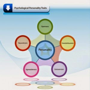
Working on the last of the research, I had to make the most of the time I had. I came across this article about the different types of traits that make up everyone's personality. Having done a bit of research on the subject, I now understand a little bit more of the topic.

What makes us who we are is something that has fascinated us for centuries. The human mind is one of the big mysteries that we still don't fully understand. The research I've done today has opened my eyes on the different aspects that determines to some degree what personality we have. This is an interesting idea, that we all have the same starting point, but have different degrees of each trait making our personality.

After my research on the top 5 traits, I had a little brainstorm about my designs. Having talked to people about the idea of the locket, the more I like it. A locket is much more then a bespoke piece of jewellery, they are for holding memories. It becomes a metaphor for the person; the outside reflecting the wearer's personality and the world see that, but on the inside is their memories, something the world can't see. It is memories that can affect a persons personality.

Talking this through with my tutors and peers, they seem happy with the idea. They also suggested different ways to present my locket and some new artists to look at. I'll look through each one tomorrow and see what inspiration I can take from them.