Thursday, 27 November 2014

3D identity cutting and shaping 27th November


Cutting and Shaping   27th November


With this being the last day of 3D I had to work hard to get everything done before the group critique at the end of the day. I started with the acrylic part of my necklace as I still had to cut out the design.

Taking the same steps as the copper sheet, I marked out my design using the paper template I photocopied from my sketchbook. I used a pen to carefully go around the template as the acrylic was transparent and any pen that was left could be seen. I took the large acrylic sheet to the saw to cut off the excess. I carefully cut around the shape like I did with the copper. I found this a lot easier to do with the acrylic as it was a thicker material and didn't bend if there wasn't anything underneath it like the copper did.

With both copper and acrylic cut out from the sheets, it was now time to remove the centre parts of my design that I wasn't able to remove before. For this I had to use the drill to make holes so I could slide the saw blade in the hole and remove the centre spaces of the design with out cutting off any parts I wanted to keep. Before I could do any drilling, I had to start with making a small dent in the copper so that the drill would easily make a hole in the metal and not slip around. I also had to cover my acrylic with masking tape to help prevent it splitting when drilled.

With the preparations done, I could begin drilling the holes. This took longer than I thought, because with each one I had to position the copper or acrylic in the right place to match up with the marks I made earlier. I also had to ensure I clamped the materials to the board so it was safe to start.

After all the drilling was finished, I could go back to the saw and finish off the last bit of cutting. This was another long process, as I had to shut everything down before I removed the blade to slide it into the holes I drilled, cut around the centre, then switch everything off again to remove the blade so I could move onto the next one.

With my design finally done, I could then start to think about moulding them together and completing my necklace.

Nearing the end of the day, I had to gather my things together and take part in the group critique. This is something I both enjoy and get a little nervous about. I find that during 3D everyone is very busy doing separate things, but the group critique gives us the time to not only present what we have done, but also discuss the starting point, our thoughts, and what we would do differently or develop if we carried on with the project. When it was my turn to speak, I started by explaining my last 3D necklace and how it was based on Celtic designs and that the Celts were part of my identity. I also explained how I wanted to research more about the meanings behind Celtic jewellery, how it had important significance to the Celts and that their jewellery wasn't just ornamental. As the Celts culture and religion is very closely related to nature, I had done some research on artists whose work is also connected to nature.

If I was carrying on with this project, I would like to look at the subject of jewellery being more than ornamental. I'm interested in the idea of jewellery being more of a statement about, or part of someone's identity, and what they are trying to say by wearing it. I would also like to investigate the symbolism behind different culture's jewellery.

After listening to everyone's ideas and talking about my own, it was time to call it a day.


Copper


Copper

The use of copper to make decorative works goes back thousands of years to ancient Egypt and to prehistory itself. Ancient Middle Eastern civilizations first used copper to create lamps, statues, jewellery and pots. The earliest known piece of copper jewellery dates to the eighth millennium BC. Copper was also fused with other metals to make jewellery and the alloying of copper and tin produced bronze. Copper was associated with ancient gods and goddesses and become so valuable that it was used as money. The colour of polished copper is deeper and richer than gold. Left to age naturally (and coated as it would be by the skin’s own oils), copper takes on a deep, bronze-like colour that adds even more interest to a piece of jewellery.

There are several advantages of using copper for jewellery. Many jewellery makers and designers use copper because it is versatile. It is one of the easiest metals to work with. Copper is very pliable and easy to cut, form and fold. Copper is easy to hammer and nothing patinates like copper. Copper is also relatively inexpensive. Today, copper can be purchased in many forms including wire, sheet, tube, chain, and beads.

The oldest metal sculpture pieces were made out of copper, copper alloys and bronze. These metals offered the artist strength while also being malleable. Metal casting as an ancient art dates back 6000 years with the first cast works made out of gold and copper. (Metal casting is the sculpting process where metals are poured into a mould.)

Copper is an extremely durable metal as it is low in the reactivity series. This means that it doesn't tend to corrode. When cared for properly, copper jewellery will last a lifetime or longer. Copper is sometimes used as a base for jewellery on top of which another metal is plated, such as silver or platinum.

Copper is a ductile metal. This means that it can easily be drawn into wires. Copper is also malleable which means it can be bent easily. These are reasons it is popular for jewellery making. Copper can also be joined easily by soldering or brazing. In fact, all these metal working techniques can be used with copper; stamping, hammering, doming, etching, and engraving.

The many advantages of copper mean that it's popular for many types of jewellery. Copper is commonly made into earrings, bracelets, bangles, engraved or carved rings, necklaces, brooches, cuffs and chokers. Copper jewellery can also be accented with enamel, beads, engravings, gold, brass, nickel or silver plating and can also be embellished with precious gemstones.

Copper is highly reactive, so it is possible to get many different looks from it. By dipping it in a sulphur solution it reacts with the sulphur to give a range of colours from browns, blues, reds, and black, depending on how long you leave it. It can also be etched with ferric chloride. It reacts with vinegar and ammonia to give blues and greens. When heat is applied, it changes colour.

Copper and bronze were popular during the Art Nouveau, Art Deco and Arts and Crafts movements of the late 19th and early 20th centuries. The malleable character of copper meant it was the perfect material for decorated items such as trays, coal boxes, cooking utensils and bas relief panels and plaques. The natural, flowing lines of these movements worked well with the characteristics of copper and bronze and pieces made with are highly sought after.

Abby Hook Jewellery


Abby Hook Jewellery

Abby Hook is a self taught jewellery maker and designer who lives and works in the UK. She works mainly with semi-precious stones and wire, experimenting with different ways of combining the two. Abby was inspired by the work of Eni Oken. Copper, bronze and silver are among her favourite metals to work with.

Many of Abby Hook's pieces have lots of hand coiled wire, using no glue or solder, just ancient methods of coiling and weaving. She focuses on intricate wire weaving, creating elegant pendants, earrings, rings, brooches and bracelets. Abby's work is inspired by nature, trees and flowers, as well as the sea. She says that even music and film has inspired some of her work. However, the most noticeable influence on her designs is the work of the Celts and the Vikings from nearly 1300 years ago. The Vikings used long pieces of silver and gold wire to weave ropes. These woven wire ropes were then stretched and made into jewellery for powerful Viking leaders. This wire weaving is called Viking knit. Abby also uses Celtic designs such as found in torques made by the Iceni tribe.


This necklace by Abby Hook was inspired by the limpets that are found clinging to the side of rock pools at the seaside. The piece captures the interesting structure of the shells. Abby has used a Viking knit technique to create a bezel setting for the stones and also to form a surround which connects each stone together. The centrepiece is connected to sections of Viking knit chain, finished with hand made wire caps and Rose quartz beads. The hand made clasp is accented with copper and rhodonite beads.

Abby says that these simple yet sleek designed copper wire earrings were developed and inspired by the torques made by the Iceni tribe. They have beautiful twisted wire detail. They look strong, yet delicate. Abby has used Viking knit either side of the hoop, which holds its shape due to the core wire running through the knit. The chain is finished with handmade wire caps, The centre of the hoop has a Rose Quartz bead. The earrings have been oxidised to highlight the intricate detail.


Abby has used Viking knit for the focal of the hoop, which holds its shape due to the core wire running through the knit. The chain is finished with handmade wire caps, Bali style and rondelle beads. The earring is secured closed with a hinged earwire. The earrings are made with copper wire and measure 1 1/4" across the outer edge. The earrings have been oxidised to highlight the intricate detail

This cuff was inspired by beautifully ornate filigree designs. Swirling wire is contrasted with intricately woven leaves, which has all been balanced with the open spaces.

This bracelet is made from copper wire. The Viking knit chain is finished with 2 handmade wire caps and a handmade hook clasp, and Indian Agate stones. The bracelet measures 7" long.

This large penannular Celtic Brooch was made with thick copper wires to form the shape, which have been twisted together, hand forged and then hammered to create a pattern. This makes the structure very strong. There are three overlapping spirals at each end of the brooch creating a Celtic inspired pattern


Wednesday, 26 November 2014

3D Identity from glass to copper 26th Noverber

From Glass to Copper   26th November


With only today and tomorrow morning left, I had to think about how I would make my necklace in such a sort time. With the glass not producing the elegance I wanted, I had to take another path to achieve the style I set out to do. If I had more time I would of gone back and changed my design, or learnt how to make my necklace out of glass using the tools I had to hand, or go to a workshop elsewhere that has glass blowing and tried to use that for my necklace.

Seeing as I had only two days, I had to change my materials. I used one of my bigger designs and decided to make it out of copper. However, to keep the see through aspect, I had to use acrylic instead of glass, making two different parts of the jewellery, layering the acrylic over the copper. I wanted to keep the transparency as it was part of linking back to the original Celtic torques, and the idea of the invisible protection it gave the warriors that wear it. As well as making it represent their connection to nature, the glass would have looked more like water. The copper loses that feeling, instead it gives the individual curls an earthy look. As for the acrylic part of the design, that will still have the clear feel, but you will be able to see the copper under it. Instead of all the necklace having the invisible protection, only the acrylic has that now.

Having chosen my materials and design, it was time to make my necklace. I started with enlarging my design so it would be easier to work from. I made two copies so that I could cut out the two parts of the necklace out for each individual material. Once I had done that I marked out the design on the copper so I could separate the amount I wanted from the rest of the sheet.

Taking the piece of copper with my design to the saw, I then proceeded to cut off the excess copper. Before I could start, I had to place a thin piece of wood under the metal so that it would be stable and wouldn't bend while I was cutting it. I found this difficult at first as it required a lot of getting used to, but with a bit of patience and practice, I soon understood how much I had to move the copper to get the angles and curves I wanted.

With the workshop closed after lunch, I had to finish as much as I could now and hopefully get the rest done tomorrow.


3D identity broken glass and new ideas 25th November

Broken glass and new ideas   25th November

With only three days left of 3D and nothing to show for it, I had to work hard to get my test piece finished and ready to go in the kiln by the end of the day. With that in mind, as soon as the lesson started I got my hands on some glass so I could start to find out exactly how my necklace would work. My first problem arose when I was told that the glass when heated using the slump technique would just fall off the plaster mould I had made and be useless. This was terrible. I had spent a day on making the mould after being told it would work, and now not only had I wasted a day on that, I had to rethink how I could make my necklace out of glass.

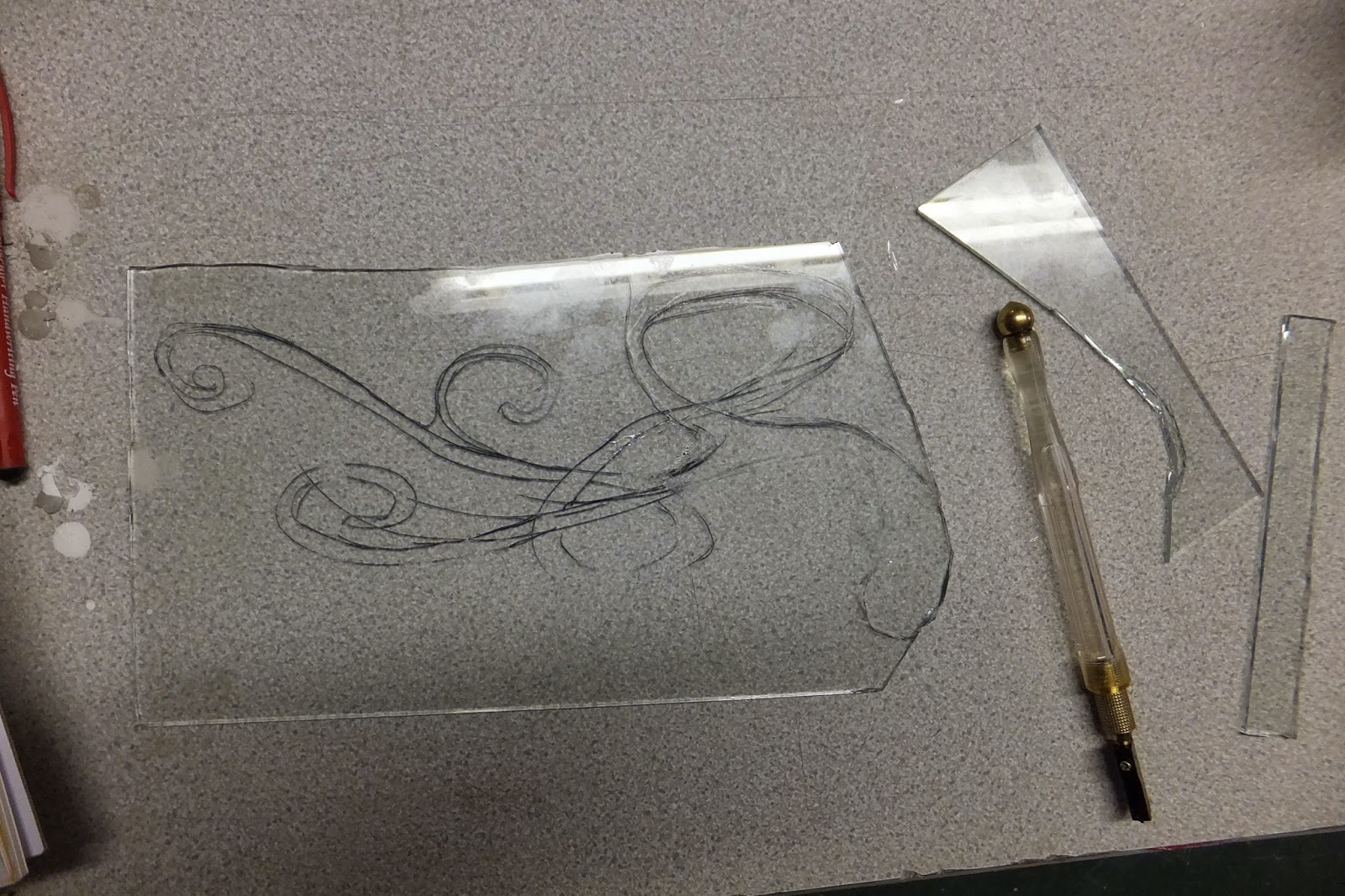
I tried hand cutting the shape of the design out from a sheet of glass with a glass cutter, a funny little tool that looks like a pen, but with oil that comes out of the wheel on the end. I started by mapping out my design on the glass with a pen. I made it a little larger so it would be easier to cut out. As I was working on the glass I could see that this wasn't going to be practical. No matter how much I tried I couldn't get the glass to cut the shapes I needed for my necklace. I had to rethink the way I was working. After a talk with the tutor, I started cutting out shapes that I could then reconstruct and assemble into my design before it went into the kiln to fuse. Even that wasn't working for me, no matter how I tried. I decided I would change my design instead and cut more rectangular shapes out of the glass and use copper wire to fix the pieces together.

After collecting the copper wirer and cutting out the pieces of glass, I only had a short time to sort out a way to arrange them. After a long day of testing I was left with not much to show for it. The glass wasn't working the way I wanted it to. The copper wire and glass piece not only looked ugly, but sharp and dangerous. It wasn't a successful day. My next idea was to use a copper sheet, cut out my design and have the glass fused to that. It might work. With only two days left I was hopeful.

I set myself a difficult task. I wanted to work with a new material and learn how to use it. I have learnt a lot about different ways of working with glass, but none that can help me with the tools that are at my disposal. I'm hoping I can make my next attempt work tomorrow.


Saturday, 22 November 2014

3D identity art nouveau

Art Nouveau

Art nouveau was an art movement that swept through the decorative arts and architecture in the late 19th and early 20th centuries. Art Nouveau was aimed at modernising design, seeking to escape the historical styles that had previously been popular. Artists drew inspiration from both organic and geometric forms, combining the two to create elegant flowing designs which resulted in a unique style.

The desire to abandon the historical styles of the 19th century was an important force behind Art Nouveau. Industrial production was, at that point widespread, but the standards of the decorative arts were increasingly slipping compared to the earlier periods. The practitioners of Art Nouveau sought to revive good workmanship, raising the status of craft, and producing genuinely modern design.

The advent of Art Nouveau can be traced to two influences. The first was the Arts and Crafts movement around 1880 which was led by the English designer William Morris. This movement, like Art Nouveau, was against the designs and compositions of Victorian-era decorative art. The second was the current vogue for Japanese art, particularly wood-block prints, that influenced many European artists in the 1880s and 90s, including the likes of Gustav Klimt, Emile Galle and Arthur Heygate Mackmurdo.

It is said to be difficult to pinpoint the first work or works of art that officially launched Art Nouveau. Some argue that the patterned, flowing lines and floral backgrounds can be found in the paintings of Vincent van Gogh and Paul Gauguin represent Art Nouveau's birth. Most critics point to the origins in the decorative arts, in particular to a book jacket by English architect and designer Arthur Heygate Mackmurdo for Wren's City Churches. The design depicts serpentine stalks of flowers coalescing into one large, whiplashed stalk at the bottom of the page, clearly reminiscent of Japanese-style wood-block prints.

3D Identity Glass techniques


Glass techniques


Blowing glass is one of the oldest glassmaking methods. It is where a glassblower works at a furnace, and uses metal rods and hand tools to blow and shape molten glass into almost any form. As well as being one of the oldest techniques it is one of the more popular ways to work. Most large hollow pieces are made using this method, but care and a steady hand is needed to continually rotate the pole so the glass has an even form while it is still molten.

Cast glass can be done at the torch or in a kiln. Normally the artist makes a mould out of sand, plaster and silica which can be filled with either clear glass, coloured, or patterned glass, depending on the techniques and effects desired. Large scale glass sculpture is usually created this way. Slumped glass and fused glass is similar to cast glass, but it is not done at as high of a temperature. Usually the glass is only heated enough to impress a shape or a texture onto the piece, or to stick several pieces of glass together without a glue.

Etched glass is created by dipping glass that has an acid resistant pattern applied to its surface into an acid solution. Also an artist can engrave it by hand using wheels. Sandblasting can create a similar effect.

Another type of glasswork is flame-worked glass. This is where torches and kilns are used. The artist generally works at a bench using rods and tubes of glass, shaping the glass with hand tools to create their work. Many forms can be achieved this way with little space needed and at small cost. The artist is limited in the size of the work that can be created, but a lot of detail can be achieved using this technique.

Thursday, 20 November 2014

3D identity Moulding my ideas 20th November

Moulding my ideas   20th November


The first part of the lesson was devoted to explaining what we need to do for our design sheets, as well as looking at some examples. This was very helpful as there are so many different styles and ways to make a design sheet. We were also showed how to stretch paper over a board by taping the paper to the board and lightly wetting it.

After the talk I did a bit of research and had a talk with the tutor about my ideas; where I was going, and what I wanted to do. With some good feedback, I started thinking about how I will make my jewellery. I also had some different areas to research.

I was ready to start testing out some glass, but before I could I had to make a cast for my glass to sit on when it's in the kiln. Taking a plastic manikin, I took my pencil and lightly marked out how big I wanted the cast to be. I then took some clay and made a barrier around the marked area so I could pour the plaster in to make the mould. I made sure there were no holes and that the walls of clay were tall and strong enough to hold it all in place while it sets. This was time consuming, but once done I could them make more moulds from this one with a lot less effort. Having made the walls, and around the manikin's shoulders and neck, I was ready to make some plaster. I took a bowl with cold water and carefully poured in the plaster until it was about the same quantity of water. It was easy to see when you get the right amount because the plaster stops dissolving in the water. With the right amount of plaster and water, I then had to carefully combine the two together to make a smooth mixture being careful not to add any air into the plaster as this would make it unstable when it hardens. After making sure it was properly combined, it was time to pour it onto the mould making sure it was evenly distributed. With the first batch done I then had to make two more bowls of plaster before I could leave it to set for the night. Luckily I had just the right amount of time to get it all done before the end of the day.

With the plaster setting I can hopefully get another mould done tomorrow.

Wednesday, 19 November 2014

Photography The Dark Room Experience 19th November


The Dark Room Experience   19th November


With last week's photography lesson all about taking photos, this one was about developing photos. It was something I had always found interesting, and being able to do it myself was a great experience. We started with a run down of what we had to do.

We started with taking the film out of the camera. This has to be done carefully and in a dark room because if the film is exposed to any light it would have ruined the photos and we wouldn't be able to use them. With that in mind we were then given a run down of what we had to do step by step. Each step had a number of instructions. We then took it in turns to develop our films. As we had taken our photos in pairs, we were sent in the same pairs to develop them. I had the task of going into the darkroom and loading the film onto reels in a light-proof tank. This was harder than it sounds because not being able to see anything was disconcerting. I had to completely rely on my sense of touch.

It was now time to start the development process. We started with mixing 560mls of water at 20C  with 80mls of developer. We then had to leave it to stand for nine minutes, agitating for 10 seconds every minute.

After pouring the liquid away, we added 320mls of "stop" per film and agitated that for 30 seconds.

After emptying the container again, we could then pour in 320mls of the "fix" solution leaving it for 5 minutes, agitating it, then leaving it again for another 5 minutes.

Finally we could take out the film, pour away the fix and leave the film in a bowl of running water for 5 minute, adding a couple of drops of washing up liquid to the water to create a surface on the film so it wouldn't be scratched so easily.

After that, our photos were developed. It was a long, but interesting process. Every stage was different and something you don't normally do with digital photographs. I really enjoyed it.

3D Identity Researching jewellery 19th November

Researching Jewellery   19th November

With it being the second day of 3D, it was really the last day I could spend researching if I wanted a finished piece by next week, so I started by having a quick talk about what I was thinking of doing and what I'd researched so far.

After a quick talk with each of us explaining what we were thinking of doing, it was time to get down to business. I needed some books on jewellery designers and materials so I could get a better idea of what materials to use, so I spent the morning in the college library reading and researching Celtic jewellery, and modern designers who use glass. I also read about some of the techniques they use to create their work. The research took most of the lesson.

I was happy with the information I found. I learned a lot about the Celts and how much of their history was recorded in their art as they didn't write down stories. I found this an interesting way to keep records as anything spoken could be changed or misunderstood easily. Art can also lose its meaning, or meanings can change over time, and as with many ancient things, we can't know for sure whether all the information is correct.

I found a couple of modern jewellery designers that use glass, but the one I found most interesting was Gill Rogers. Not only were most of her designs made out of glass, but the natural forms she drew inspiration from gave her jewellery a beautiful and unique look. Her pieces were delicate three dimensional shapes.

I still have a lot of research to do, but I'm hoping tomorrow I can get some testing done.

Gill Rogers

Gill Rogers' training began in 1997 with a foundation course in art & design and textiles. After finishing she went on to study glassmaking, beginning with a course in stained glass and copperfoil techniques. She then studied kiln-formed glass techniques when she enrolled at City & Guilds just before attending university.

It was while Gill Rogers was at Lincoln University that she got her first taste for jewellery making. During her final year of university, where she was studying glass techniques to produce designs for interior lighting, she was given an assignment to design and make a number of objects to promote galleries. The assignment required a minimum of four objects. With a limited time scale, it was then that Gill Rogers first thought of making jewellery using glass.

After spending a couple of years working overseas, Rogers now works in her own studio located at Paintworks in Bristol. Rogers has said she always had a great passion and desire for design and making. Her main focus and goal is to continue to push the boundaries and create innovative designs in jewellery. One of Rogers' short-term aims is to devote more time to areas such as marketing in an attempt to get her work across to a wider audience.

With most of Gill Rogers' jewellery being predominantly made of glass, she has to be careful of what sort of glass she uses, as glass can be fragile, not only in the making processes, but also to the person wearing it. Rogers makes her designs mainly out of borosilicate glass as it is a hard glass with a higher resistance to shock and breakage than soft glass. Borosilicate contains the same properties as Pyrex, which is commonly used for producing scientific laboratory ware, such as test tubes, and also for producing various items of kitchen bakeware. Using borosilicate glass makes it a lot easier for her to create the designs she wants, without the jewellery breaking.

Gill Rogers' main source of inspiration for her designs comes from studies of natural forms. These include icicles, plants, fossils, shells, and corals. Many of her designs represent pattern and texture. Much of her jewellery has an abstract look, but they are still recognisable as natural forms. Each one of her designs has an elegant and smooth feel to them. Gill Rogers has managed to create intricate pieces using very fragile transparent material, as well as making it a solid three-dimensional shape.


Tuesday, 18 November 2014

3D design identity research 18th November

Identity Research   18th November


Once again it was time to go back to 3D for another two weeks, but this time the theme was "Identity". After a power point presentation we then went off to do some research and to come up with some ideas on what we would like to do. I wanted to continue the Celtic theme from my last 3D project as it is an important part of my identity and heritage. After talking it through with my tutor, we agreed I would carry on with that theme, but instead of continuing the same project, I would take a different aspect I find interesting and develop it in a different direction.

With this in mind I did some research. I wanted to go into the meanings behind some of the jewellery worn by the Celts. I know from my last project that each of the knots, as well as the animals on the jewellery had a different meaning. I'm sure that once I do some more research I'll find out more information on these things.

Another difference this time round is the design sheets. We have to make at least two A1 sheets of what we are making. As this is a big thing, not only for this course, but also for the portfolio, we were given a task of doing a bit of research on drawings of designs in our chosen field. This is something I found very useful as seeing how different designers work gives me a lot of ideas on how I can present my own work.

At the end of the day with a lot of ideas in my head, I went home to do some more research and hopefully sort out where I wanted to go with this theme.

Sunday, 9 November 2014

Fine Art research Steinunn Thorarinsdottir

Steinunn Thorarinsdottir


Steinunn Thorarinsdottir was born in Iceland in 1955. She studied in England and Italy from 1974-1980 before moving back to Iceland. Thorarinsdottir is living and working in Reykjavik now. She has done many commissions both for specific indoor spaces as well as outdoor works and monuments.

Thorarinsdottir uses many different materials to create her artworks including cast iron, aluminium, plaster, glass and concrete, with each material creating a different feel to each individual work. The sculptures seem rooted in chilly and wind swept Iceland, where they emanate from deep down in the volatile, volcanic substrata of her own country. Thorarinsdottir's works can be seen all over the world in different contexts and locations.

Thorarinsdottir focus on the theme of the human condition in all its complexity. The human figure has been the measure of all things in art from the beginning of history. In the shadow of art history, it takes considerable courage to select the path of figuration in our times and present something new, something personal, something in which others may feel the intensity of expression on their own in a new and surprising way. Thórarinsdóttir exhibits this to the world in all their complex nature and yet through an almost spartan simplicity of materials.

Thorarinsdottir refers to her figures as being beside our world and that they are symbols of humanity, but different. Mostly, Thorarinsdottir's figures are asexual, be they whole or ‘broken’ with each one created with their eyes closed and missing their ears. They seem to give off a feeling of loneliness, isolation, sadness and an inability to acknowledge what's around them. Despite this they also seem to be lost in thought, but they do not share their inner life with the audience; they maintain a very human privacy of emotion that we both feel bound to honour and align ourselves. Perhaps they are trying to communicate with each other in a way we cant hear or see, as if they are not really part of our reality, or we a part of theirs. Thorarinsdottir wishes them to be seen as human, as they also age like people. Metals like aluminium become less shiny and the rust becomes deeper. Thorarinsdottir has a distinct way of utilising spatial qualities. In her life-sized works, you cannot help but be aware of the fact that the sculpture occupies the same space as you the viewer.

Saturday, 8 November 2014

Fine Art research Rachel Howard

Rachel Howard


Rachel Howard is an English artist born in County Durham in 1969. She graduated from Goldsmith's College in 1991 with a degree in Fine Arts. Howard now works and lives in London, best known for her abstract and expressive paintings. Howard uses oil paint now, however from 1995 to 2008 she used household paint to create her artworks. She allowed the paint to separate inside its can so the pigment and varnish could be used in isolation. The pigment is applied to the edge of the canvas and manipulated through the addition of the varnish. Gravity then draws the paint down the canvas. While her painting technique is something a bit different, it gives her painting a very unique look. The use of strong vertical and horizontal lines also give a feeling of depth.

Howard's "Suicide Paintings" were first shown at the Bohen Foundation in New York, 2007. This series of paintings evolved after an acquaintance of Howard committed suicide. The series offers an investigation into the aesthetics of suicide. Her work not only shows the aftermath, but also some instruments of death; a pair of scissors; a ladder. Howard also uses the symbolic, lone ‘‘Black Dog’’ which is often associated with depression.

In Howard's paintings she tries to convey the present day suffering she's concerned with. In the last decade, various wraiths have been conjured between the layered lines of paint, from the black dog of depression to victims of addiction, torture, self-harm or madness.

With some of Howard's paintings the familiar metaphor for the suicidal depressive, a black dog appears. Instead of the dog being fierce and threatening it is emaciated, perhaps to mimic the helplessness of the sufferer. Then there are the smudgy black figures with faces obscured, their shadowy, disintegrating bodies given up to their final moments. With each body of her work she's directly concerned with exploring the intricacies of what it means to be human, considering our capacity to feel, think, question, hurt, breakdown, worship, sin, rebel or conform. Howard is interested in the extent to which her paintings might physically and emotionally resonate with the viewer. Rachel Howard uses her style of painting to great effect on a subject that isn't greatly talked about and brings awareness to a matter through her art. Rachel Howard makes the viewer think more about such subjects such as suicide and depression.

Thursday, 6 November 2014

Fine Art The final day 6th November

The final day 6th November


With today the last day of fine art, and the last of the subjects, it was important to go out on a high. I had to get in early to get everything ready for my installation. With a list of things that needed to be done, and with only a short time to do it, I worked out what would take longer, and what other things I could do while I waited.

I started with a trip down to 3D. I wanted to make my box heavier and fix my lid on with glue and nails. I also asked about hanging my cube up in the room. This was a very important part of the process because the weigh of the box was an integral part of the interaction I hoped for with the finished piece. I wanted to draw attention to how much mental "weight" depression could have on a person by letting the viewer physically hold the work and experience the 'heaviness'. Secondly, I wanted the viewer to think how difficult it would be to do normal day to day things whilst having that weight on them. I know from carrying it round the college and back to my house it is very difficult. It was such an effort for me to carry it around, to walk and open doors, that by the end of the day I felt physically exhausted. In a similar way, having a "mental weight" would make it very difficult and stressful to do anything.

As for the cube hanging in the room, I had an idea to make it more noticeable as well as deceptively light. However, I wanted it so once the viewer tries to hold it the box, the weight becomes apparent. This is a way of trying to get people to understand depression. It may appear to be light to an outsider, but in fact it isn't. People with depression might appear to be coping, but in their mind they aren't. This is a danger of depression, the person may not feel like they can reach out for help which can lead them to becoming isolated and more depressed.

With the lid fixed and the chain sorted I then had to make sure my cube was ready to be fixed to the ceiling. First I had to paint the black dog on it. I wanted the face to be noticeable, but not too much. It was like in the engraving with the skull in the truncated rhombohedron, only when you look at it closely will you notice the shape of the skull. This being much like depression, it can be something that is not easily noticed by other people.

With some spray paint and templates, I quickly sprayed the dogs head onto the corner of the box and some ribs on the side. I wanted the face of the dog to be protruding out of the box as if it was ready to strike the viewer. I also wanted to have the dogs ribs on the sides. While researching about depression, I found that one of the many signs was the loss of appetite.

After the paint had dried, I could have it fixed up on the ceiling with a chain. The chain itself was also a symbol. It represented the trapped and confined, held back feeling associated with depression. I then fixed up the paint a bit before moving onto the background. With such a dark black box, I wanted a contrast with white, not only so that the box itself would stand out, but also when the light shines on it there is a clear shadow cast on the floor.

Time was up. I was happy with my installation. The only thing left to do was present it to the group for feed back. I started by talking about the engraving and how I interpreted the angel being too depressed to create despite having all the tools around her, and how in today's world there are 'tools' to help people with depression. The problem is that depressed people can feel too isolated and cut off and cant use the 'tools' that are available to help them.

My initial ideas for this work started off as an image of a person in a box in the centre of a maze unable to get out because they are cut off from all exits. I also envisaged a black dog looming over the figure as if to cover and envelop them. I decided to change the idea, making the artwork more of a physical thing, a tangible object to enable the viewer to physically experience a weight just as someone suffering from depression feels that mental weight on them. I was going to paint a maze on the box, but with little time to do that it wasn't possible or practical. Also, too much detail might have detracted from the feeling I wanted to achieve. By painting the box all black, the cube itself has a presence in the room that I was happy with.

After explaining the meaning behind my installation, it was opened up for comments, which were mostly positive. There were a couple of questions on how and why I chose the chain, or about the dog, and if there was anything I would change. If I was going to take this work further, I would make the dog's face a bit bigger, and higher on the box. I would also smooth the edges of the box, but keep the corners sharp. I would also hang it a little lower so it would be easier for people to lift and feel the weight.

Fine art has been an interesting journey with both projects done in only a week. It shows just how much you can do with three days of hard work.

Wednesday, 5 November 2014

Fine Art The Black Box 5th november

The Black Box 5th November


With only today and tomorrow morning to finish my fine art piece, I had to get in early to have a chance on finishing it on time. With my box made yesterday and ready to be painted, I had to decide what would be on it. My original idea was to have the each side tell a separate story, or show a different state of depression. The thing that would be hard about that idea was it might take too long to paint. I had to finish on time and thinking up six different ideas in such a short time and paint them would be a hard task.

Just as I was mapping out my drawings, the tutor came to see what I was doing. After I told him my ideas and how I would like my cube to turn out, he asked if it had to be so detailed. The main purpose of the cube is to have the ability to feel the weight of depression as if it was a physical thing, so why not have it more as a dark abstract object? The talk moved to having a black box hanging so the people could come and feel the weigh of it and also view it as an object.

I find talking my ideas through very helpful. Having to try and gather my thoughts together so that someone else can clearly understand makes me think carefully on how my idea is formed. Also, the questions they ask are useful because they make you think of things you may have forgotten.

With ideas being tossed around, I thought keeping the black dog on the box was something important. It interested me having the idea of depression as not only something that hangs over you, but as a being, an animal that is always following you. With so much happening from the last day, my design had become something very different from the original 'maze'. However, I think this is a good thing and the interesting part is my original idea or concept hasn't really changed very much. There is still a black dog looming over a person, only the person isn't in the painting now. I think that's much more engaging for the viewer.

With a lot to do and little time, I got down to paining my box black. This is something that would take the longest as the paint would have to dry in between coats, and I would have to give it at least two coats of paint before it would be dark enough. I started with the top, then worked my way around. By the time I had done the bottom, the top was just dry enough to paint again. I had to do three layers of paint so that I couldn't see any of the white showing through. While it dried, I went to look up ideas for putting my black dog on the box. By the time returned, the class was over and I had only 5 minutes to get to my next one.

With so much still to do, I have to get in early tomorrow so I can make sure I have the nice people in 3D all to myself.


Tuesday, 4 November 2014

Fine Art One Fine Box 4th November

                                                                      
One Fine Box  4th November 

Last week's Fine Art was a group session. Our group made a 3D interpretation of the engraving Melancholia I by Durer. Today's lesson was the first of three that will be my own take on the subject. This was difficult in many ways; I already had ideas that I put into the first interpretation and I wanted to make something different to that one, but it still had to have the same theme as the engraving.

After doing a bit of research, the idea of a maze came into my mind. I wanted to draw on the fact that depression can be where it feels like being trapped in a maze, as well as having a weight on your shoulders that makes it hard to get up in the morning and carry on with the day ahead. Even with people's encouragement you still cant find your way out of the depression. This linked in with the angel in the engraving. Despite having the tools around her to create, she still couldn't bring herself to do anything. With this in mind I wanted to have a image of a maze, and at the centre would be a figure in a box. They would be surrounded, wanting to communicate and find their way out of the depression, but they are unwilling or unable to do so. Hanging over them would be a symbol of depression, a black dog. It would be heavy and oppressive, almost as if it might crush them.

While talking to the tutor, the idea of taking the puzzle side further came up. Instead of making a painting I thought about making it more of a puzzle, or something the viewer could interact with. We talked about it being a cube or die, with the sides showing different states of depression. After talking it through, I had a lot to think about. The idea of the box really interested me. I liked the idea of being able to lift the artwork and actually feel and imagine the weight of carrying the depression with you. If I was to do a box, I needed to get it done today so I could have time to paint it. As soon as the group knew what they were doing I was off to 3D to make my box.

I'd never made anything in wood before and making a box seemed like an easy task. I was wrong. It needed precise measuring and a steady hand to make a cube. It started with measuring. I wanted the box about 14in by 13in, but the problem was finding materials to make it.

After a quick look I found a large piece of wood that was ideal for what I wanted. It was only slightly smaller then the original size I had in mind. With the pieces mapped out it was ready to be cut and time for me to have a go on the saws. It was very much straightforward, all I had to do was cut the sides and top out making sure I kept everything even. I had two goes with the saw, once to cut the sides of my cube down so they would fit together, and another to cut the top off them. This took more time than I thought as I had to make sure the measurements were all correct before I could start cutting. After that was done I had to fix my box together. I started by clamping the sides so I could have them standing upright, then I glued them in place. After I had done the sides of my box, I could then fix the bottom onto it with more glue. This was a messy procedure, but it was all worth it. After using a couple of nails to make sure everything was secure, my box was done.

Thanks to the help of the lovely people down at 3D, I was able to complete my box by the end of the day. Now all I have to do is paint it and I'll be finished.


Sunday, 2 November 2014

Fine Art Research The black dog

The Black Dog


The dog has been used as a symbol in myths and folklore, poetry and paintings for centuries. Usually they symbolise loyalty, protection and fidelity. Dogs are probably the oldest and closest of man's animal companions, so it is easy to understand why they embody so many qualities associated with loyalty and companionship.

The dog has also long been considered a liaison between the physical and non-physical worlds. Ancient Egyptian, Greek, Roman, and Celtic have all described the dog as a sacred guardian of the 'Otherworlds'. Dogs are often the guardians of ephemeral domains.

Some of the earliest references to the "black dog" is in folklore, where the black dog was associated with the devil, bad luck, or even an omen of death. Seeing the black dog was not a good thing. The black dog was often said to be larger then a normal dog and have glowing eyes. It was thought of as a bad omen and was said to be seen around crossroads, places of execution and ancient pathways.

The "black dog" is also recognised as a synonym for depression. Winston Churchill used the phrase "black dog" when referring to his own depression. Paul Foley said, "(the black dog) ... is an ever-present companion, lurking in the shadows just out of sight, growling, vaguely menacing, always on the alert; sinister and unpredictable, capable of overwhelming you at any moment."

Today, the black dog is a symbol of dark and menacing things, a nagging depression that can follow you relentlessly.


http://www.blackdoginstitute.org.au/docs/Richardson.pdf

http://www.blackdoginstitute.org.au/docs/Michael.pdf

 http://www.blackdoginstitute.org.au/docs/Foley.pdf

http://www.blackdoginstitute.org.au/docs/Huet.pdf


Fine Art research Michael Price

Michael Price


Michael Price is an English artist born in Stoke-on-Trent. After a lot of traveling, he moved to New York in 1999. In 2007 he started a studio that teaches artists the old ways of using natural and mineral pigments and their application in oil binding mediums.

In his paintings, Price tries to achieve a sense of timelessness through his exploration of the nude and human figure. In his art he looks at the nude to find the incredible beauty that he sees in the core of the human figure. Almost all of his work starts with drawing from a life model or occasionally looking at ancient Greek sculptures. After drawing many different poses and studying the movement and form of the model, these studies are then taken and used to create the final artwork. Price not only sees the human figure as a body, but as something beautiful, an extension of our divine nature. When he is painting his nudes, Price tries to make them seem as though they are in a timeless universe, revealing the archetypal images as a spirit or energy in the physical world we inhabit.

This way of seeing the tangible and finite world, provided Price with the inspiration for his painting process. He wanted to use the same mineral pigments and gold leaf like the old Renaissance Masters did. The colour for his paint is produced from rocks and crystals including lapis lazuli, azurite and cinnabar mixed with an egg tempera. They create the vivid colours he works with.

In using this style of oils he had to learn a whole new way of painting. Instead of painting over any mistake because the colour of the paint was too bright and translucent to cover the underneath, he had to plan out every part of his paintings. Just as the Renaissance Masters did with their paintings, geometry became very important to Price. This was not only in terms of the proportions of the figure, but the relation to the rectangle, making note of the height and the width. Many of his works refer to the Old Masters who steeped themselves in Euclidean geometry and the philosophical ideas of their day. “Homage to Dürer, Melancholia I” is Price’s modern take on the Master’s angel contemplating the Philosopher’s Stone. Price takes the old ways of painting and turns it into his style of a timeless world.

Price hopes that his works hold up a mirror for people to see the beauty in the world, a world sometimes there isn't much good news to be heard. He believes they need only look to find it.


Saturday, 1 November 2014

Fine Art artist research Mathew Borrett


Mathew Borrett

Mathew Borrett is a Canadian illustrator and visual effects artist who works with architectural illustration and also creates wild and sometimes elaborate imagined structures, some underground, some in cityscapes. He creates networks of compartmentalised dwellings that appear to be carved into the face of a cliff or dug into the ground with isometric perfection.

Borrett also explores imaginary landscapes that have a science fiction or fantasy feeling about them. His underground structures are maze-like and are remindful of Escher's work in the way they extend underground in fascinatingly detailed cutaway views of interlocking rooms, tunnels, stairways, and halls. The beautifully complex maze of tiny rooms sometimes appear to be carved from a solid white page. Many drawings seem to defy logic, which makes them more fascinating. Borrett divides space in an interesting way. Some drawings look as though they have developed from more traditional architectural subjects, especially the ones which feature cut-away sections.

Borrett says about his childhood, "During those weeks of the summer when too much pollen was about, I’d retreat to my room where I would draw, build elaborate things out of Lego, and make primitive computer graphics on my Commodore 64. If I really liked something I’d built out of Lego, I would draw instructions on graph paper for how to build it again."

Borrett also said that he had, "a fascination with maps and architecture, a penchant for detail, and recurring dreams of finding strange hidden rooms in his house." It is obvious that these childhood experiences were important in his development as an artist and the influences can be seen in his wonderful detailed maze-like drawings.

The labyrinth-like structures in his drawings are surreal and puzzling. Scale, physics and logic are of no importance. Bedrooms exist with no entrances and doorways lead you nowhere as you wander through the maze. Borrett's drawings draw you in and invite you to get lost in a hidden world.

Photography artist reseach Man Ray

Man Ray  Photography

Man Ray was born Emmanuel Radnitzky in 1890. He was an American artist who spent most of his career in Paris. Man Ray was associated with Dada and Surrealism, while his work included photography, painting, film, sculpture, and prints.

Man Ray is best remembered for his photography, despite the fact he considered himself a painter. His experiments with photography included photograms (camera-less pictures) which he called 'Rayographs' in reference to himself. Man Ray was also a fashion and portrait photographer with many of his photos published in magazines such as Harper's Bazaar, Vu, and Vogue.

Throughout the 1920s and 1930s Man Ray experimented with photography through portraiture; a means of capturing the activities of his avant-garde friends. He described himself during this time as "an official recorder of events and personalities." The list of people in his portraits is impressive. Salvador Dali looked like a circus magician. The Surrealist Meret Oppenheim was photographed in the nude, smeared with black ink from an etching press. Ernest Hemingway, James Joyce, Gertrude Stein, Picasso, Matisse, Duchamp, Salvador Dali were all his subjects. Many of the portraits have a feeling of playfulness.

Man Ray also experimented with a technique called solarization, a kind of overexposure which adds a silvery, ghostly quality to the image. In a solarised black-and-white portrait of Lee Miller, who was his lover and model, her hair looks like "a helmet of beaten gold."

Man Ray had a distinctive technique; he worked quickly and didn't instruct the sitter because he wanted the portraits to appear natural. His portraits of the social elite during this time suggest a mutual respect between the subjects and the photographer. The great artists and writers who sat for him probably understood that they themselves were equally in the presence of a great artist.

Photography for Man Ray operated in the gap between art and life. In some of his photographs he seemed to be documenting sculptures. Man Ray said he would photograph an idea rather than an object, and a dream rather than an idea. During the 1920s he at his peak as a conceptual innovator. It was at this time he produced his most recognised and popular photograph, "Le Violon d'Ingres".

Le Violin d'Ingres is a photograph of his lover, an actor known as Kiki. (The title is a French expression that means "hobby".) Man Ray drew two black shapes on her back to make her appear like a musical instrument. The photograph references a painting called 'Le Bain Turc' painted by neoclassical French artist Jean August Dominique. The resemblance of the shape of Kiki's back to a violin, with the added f-holes make this a classic Surrealist work. Le Violon d'Ingres is a visual pun, depicting his muse, Kiki, as his Violon d'Ingres, his 'hobby'. She is presented as a passive instrument or plaything.

Man Ray was an innovative and creative photographer and artist. His contribution to photography marks him as one of the greatest artists of the twentieth century.